Lorem ipsum dolor sit amet, consectetur adipiscing elit. Etiam aliquet arcu et mollis facilisis. Cras efficitur tincidunt odio, ut ultricies metus aliquet eu. Vestibulum volutpat, purus eget ultricies vestibulum, enim ipsum suscipit ante, non tincidunt elit lacus sit amet sem.
Data Pollution
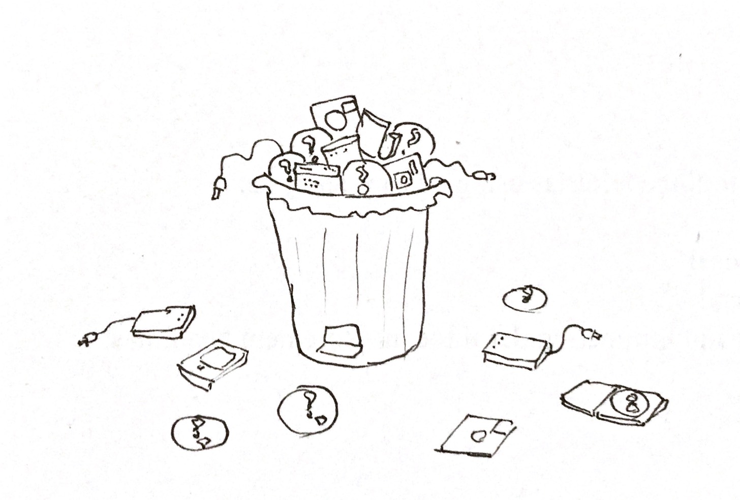
Data Pollution is a real phenomenon, and somehow we don’t think about it, or care about it very much.
What is it? It is data that is redundant and/or doesn’t serve any real purpose. It only purpose is to exist. It has been forgotten by us. They are the shoes that you will never wear. They are the spices that you will never use. They are the frost in your freezer.
Every byte of data that has been created over and above the need of humans or other programs must reside in memory somewhere. If it exists in volatile memory (such as your computer’s RAM) it is not a problem, since it will be cleaned off anyway after you turn off your computer – but when it becomes permanent memory, such as your hard drive, then it may turn into data pollution.
Data that is not on your computer and has been transferred to a data center (such as the website you are reading right now) is stored on one of 9 million data centers around the globe. These combined contribute to 17% of the global carbon footprint caused by technology. On top of that, these data centers are wasting 90% of the energy they are using (source). We need data centers now because our data storage needs are immense. 90% of the world’s data was created in the last two years alone. We produce 2.5 quintillion bytes of data every day (source).
An example of data pollution is two photos which are very similar. People generally take multiple selfies – they choose the selfie that they like the most, and share it on social media, but the others stay on your phone’s disk, and are therefore join the vast silos of pollution. With the help of image processing algorithms which utilize a very basic level of machine learning this data can be found and deleted. A burst photo set can be 10 photographs or more, and if you select one of them and discard the others, you are cleaning up the cloud just a little bit.

Even redundant data (meant for restoration in the case of a system failure) is pollution. Most of it is not necessary, since the failure rate of a given system may be low (modern cloud systems guarantee 99.99% uptime). So only 0.01% of redundant data is useful. But we keep it anyway because we have to keep our shareholders happy so that we can deliver that beautiful 99.99% number to our customers.
I used to write all the Anime that I used to watch on CDs and then DVDs. I had more than 50 DVDs for Inuyasha alone. Combined, I estimate more than 400 CDs and DVDs (and I am not even talking about my games and movies). I know now that this was totally not necessary.
It is possible to clean data pollution at a very early stage. But as time passes by, the pollution becomes harder and harder to clean. Automated backups will move your hard drive’s contents to the cloud, at which point you have to manually delete data there (it is often not very easy). If your data is being versioned, then old data is being archived (using tech like Amazon’s Glacier), and it is harder (read ‘boring’) to access it and get rid of it. What are you going to do with personal videos that you are not going to use? They could be gigabytes of content like this. There is data that you are never going to need on your old computers. And you may move to another country leaving all your old drives behind.
It is time to recycle all the devices that you are not using. Old hard drives that have thousands of movies you saw: you don’t need them anymore. Simply make a list of them. Use a simple terminal command to list them and save them in a spreadsheet. If you want to watch them again later, rent them on iTunes. Only keep one drive with your most important data. Do not keep multiple copies of your data. One is enough. Delete all your selfies. They serve no purpose. Selfies are the worst kind of pollution. Instagram thrives on such pollution.
Ultimately data pollution (in the form of software) becomes tangible pollution (hard disks that are no longer needed, or plastic USB drives – millions are produced but not useful, and after they get damaged, they must be thrown away).
Please clean your data before it becomes a problem to yourself and others.
Boostrap is dead – Long live Bootstrap
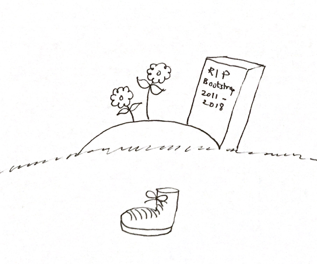
I have often worked with people and companies who have used Bootstrap in their products. For several years people have used Bootstrap to make responsive, user friendly and fairly consistent looking web apps.
Before I begin to talk about why I don’t think Bootstrap is a good idea for your products, I would like to go into its history. HISTORY LESSON! (summarized from LiveEdu.tv)
Boostrap was originall built for Twitter. The purpose was to make the interfaces of various products within Twitter look and feel consistent. It was first released to the open developer community in 2011, and since hten it has been improved with lots of new features and visual components.
Until now, people want to build their products using Boostrap. They import a few JS and CSS files, and learn the vast vast knowledgebase of the Twitter library, and start adding Boostrap classes to their visual components. You could have something looking like this:

To this, in no time at all: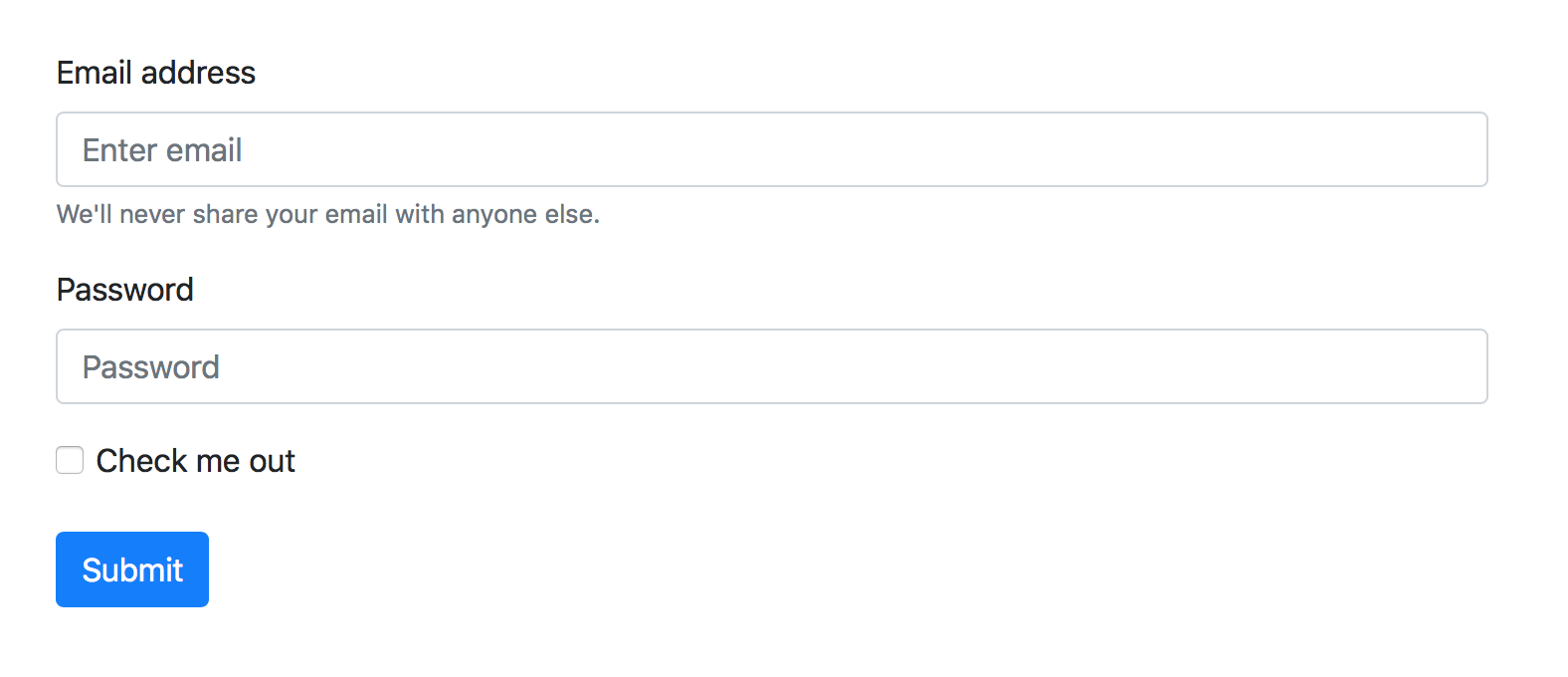
I’m sure you can see the appeal of using this library. The code of something like this is fairly easy to set up – you only need a basic knowledge of forms, HTML components and basic CSS to get this up and running.
Once you are knowledgable about Boostrap’s library of controls, you will be able to make an app fairly quickly…
… that looks the sameas every other app using Boostrap
… that follows the early branding guidelines of Twitter
… and is very hard to extend within your own app
The first two points may not be that important to you, but the third point is important from a branding and design point of view. Once brand guidelines have been defined, it is very hard to sway from them. The various elements within your app will have to conform to these guidelines to the pixel. Product owners, marketers, and pretty much anyone who is not involved in the development of an app is very very particular about how the app looks, and how well it conforms to the visual guidelines defined by your company.
Sure, if you are getting started, and you don’t have any guidelines to adhere to, you don’t have a problem. But things start going downhill very fast.
Imagine that you are required to make a simple button in your form, and your guidelines say otherwise, as shown by the following diagram:
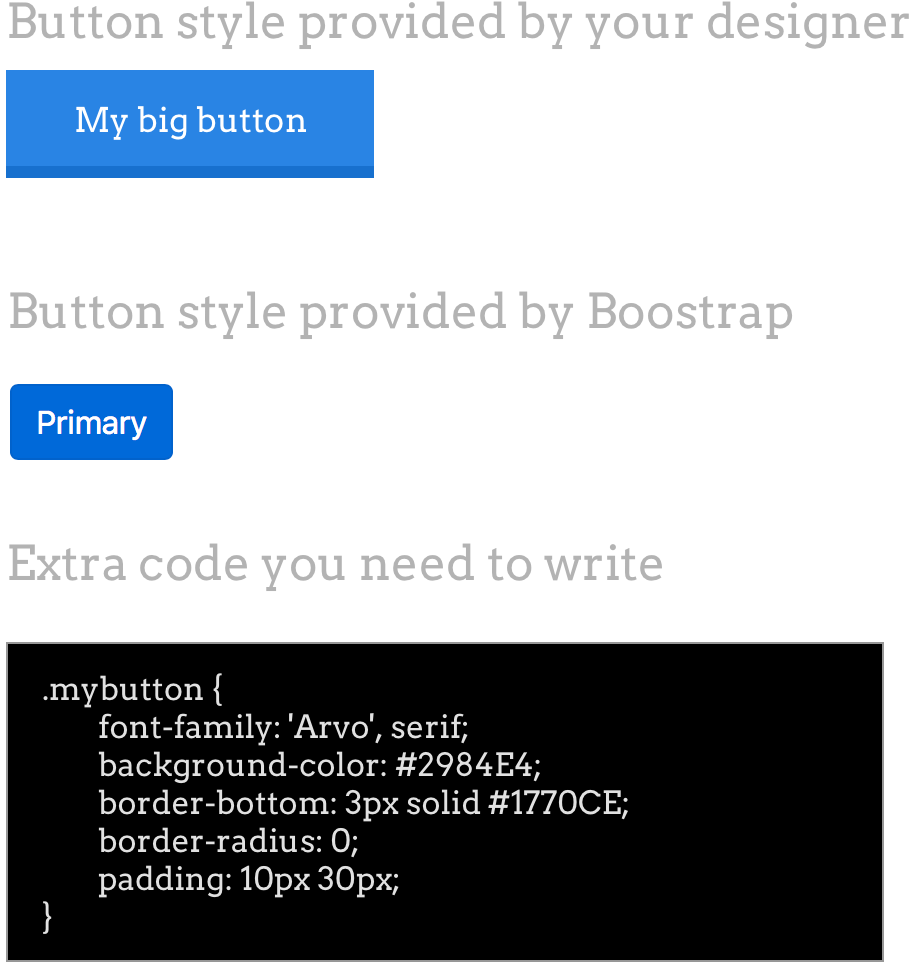
You will end up having a big stylesheet that is basically overriding all the various components of boostrap. Inspecting your web element will show a whole lot of crossed out elements, and then finally your preferred element will be displayed at the very top.
Disclaimer: There is nothing I hate in this world more than !important
And here we have arrived at the purpose of my blog post: If you are a full stack developer like me, and you have to closely follow your visual guidelines (whether you made them yourself, or someone else made them) you have to write a lot of code to make sure that your visual elements are in sync with your guidelines.
Things become worse when your app must be responsive, and you have to override your overrides to make sure that your components work well.
So, there is no reason to include Boostrap in your product. If you are making a prototype app, then sure no problem. But as with every prototype you should make, it should be throw-away code (discard it after you use it). There is no reason to learn all the components in Boostrap’s library – make your own, and make sure your company follows them, just as Twitter once did. What should be learnt from Boostrap is not their vast library of components that has been engineered so that every app in the world can use it, what you should learn instead is that your company and your product has well-defined guidelines, and that every member of your team are well aware of them, and follow them.
You will over time improve your own guidelines and include new components that your product needs, and you will become more efficient in making visuals using your own hand-written code.
Update: One question I perhaps didn’t answer is ‘why now?’. To answer this, I will simply say that now is the time to give it up. In this day and age, we are required to program quickly and make the first version of the app in very little time, and therefore frameworks like Boostrap have a strong appeal. But if you are thinking long term, then you should have a set of visual components that you should use, and that you have full control over how they appear. You will then also have the ability to easy port your own visual components to other frameworks like React Native or Angular, and you will be able to build brand-accurate mobile apps too!
To buy or not to buy WordPress themes
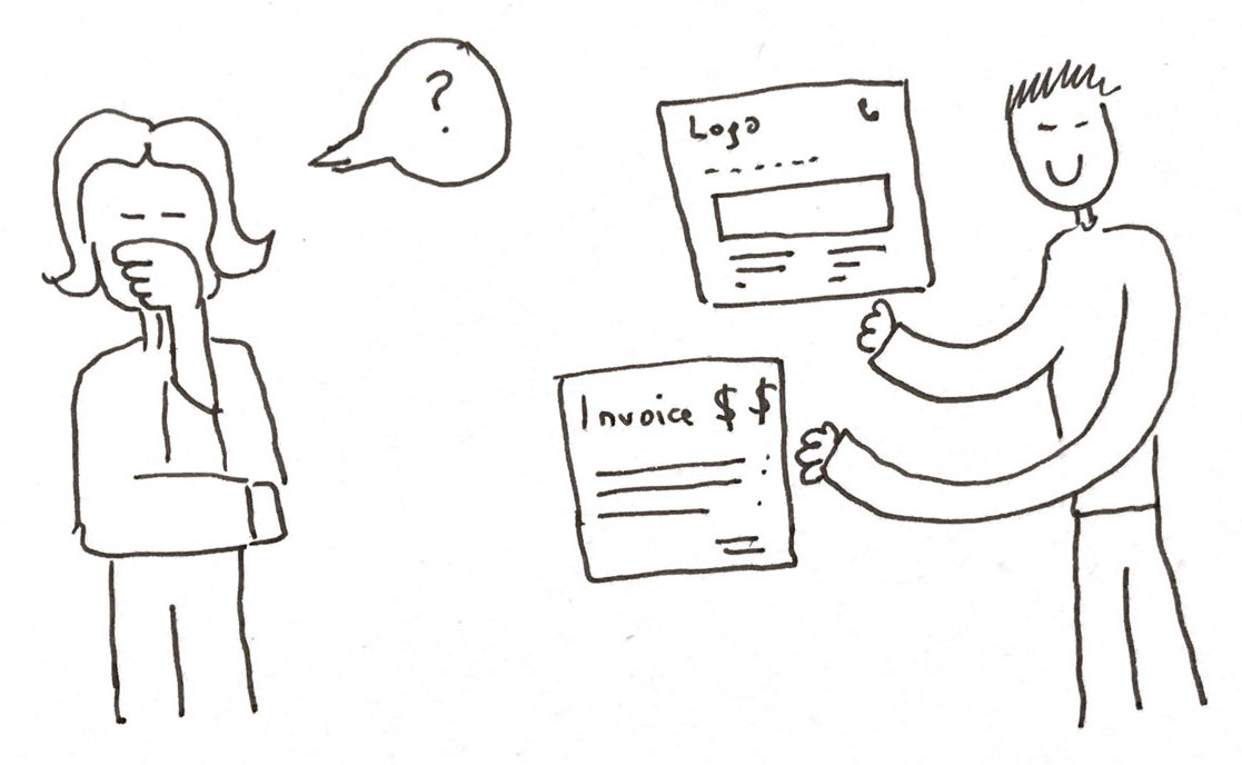
I have been in many situations where my customer was deciding whether to purchase an existing theme or make a new one from scratch.
At first at my company we were doing both. We were making templates for customers and also purchasing and installing themes from popular sites like theme forest. But after doing this for about three years we now exclusively make templates from scratch. This shift has made it much easier for me to do work for various customers and I suggest you do the same. Now I would like to talk about some reasons why we made this change and I hope you can benefit from this
Purchased templates are too general: This is my very first concern and it doesn’t really come up that often in the mind of the customer, until after they have already purchased the template and they have added content to it.
Templates that you buy have a ‘generic’ theme. They are designed so they can work with any branding, but that’s simply not possible, unless if your branding nearly exactly matches the branding of the template.

Sure most themes allow you to change colors, but they don’t let you change visual components of the theme, such as the design of buttons or various components of their slideshow. If your brand uses curves and the template has straight lines, it will work at first, but then your template design will go downhill very quickly.
It is easier to make your own: Depending on your experience, it may be easier to make your own template. Wether it is from scratch or if it is based on a template you made already.
In the long run it is cost effective: You don’t have to worry about updates to the purchase template breaking changes you made.
The customer knows the developers and has a direct relationship with them: Depending on how good their service is, the developer of your purchased template may have insufficient documentation, may not be willing to acknowledge your emails in a timely fashion, or simply won’t care about providing a good QoS.
It is easy to improve over time: You know your code, and making improvements over time is easier.
Restoring from failed servers is easier: If you are using source control, you will always have a copy of your template on your machine, and it’ll be easier to recover.
Plugin compatibility is much better: Sometimes templates come with packaged plugins. These plugins can’t be updated if you run out of the service contract time on the template. Then you are stuck with out of date plugins on your website, unless if you purchase another year of service or your template.
I hope that after reading this post, you will favor more creativity, and not buy boiler-plate templates.
Shared hosting or moving to the cloud? Things to think about.

A lot of my customers do not have a big budget for making their websites, and therefore they prefer to go with shared hosting companies like Godaddy and Bluehost. For less than $10 a month you can get a domain name and a hosting plan, which says that you have ‘unlimited’ bandwidth and hosting space. This all sounds great, but you run into problems very quickly, especially when you have sites that gets traffic from the internet (versus projects that are not accessible to search engines).
These problems are not so visible in the first year or two, but they start creeping on you and your company very slow, until you are at a point where you have to find someone to fix these issues, otherwise you are at a great risk of losing valuable data and customers. I will list some of the problems that my customers have encountered over the last decade:
You have no control when a server failure occurs
If your server fails, there’s nothing you can do about it. You can’t login to your system and see what’s wrong. You don’t even know what your system’s specs are. You don’t know how much RAM there is on the server, maybe your server was running a process that took a very long time and caused your server to stop responding to other requests. Maybe the server shut down for some other reason. You don’t know. You can only wait for things to resolve on their own.
A developer on your team can usually give you an estimate and tell you how long a problem may take for to resolve, and steps you can take to communicate with your customers, but since you don’t have anyone to take care of your server, you are on your own.
There are no backups, so you suddenly lose all your data
The backup processes running on shared servers are very confusing and it takes a very experienced developer to really understand what’s happening. Somewhere deep in their management console is the backup setting, and it may not even be turned on. If it isn’t and due to some mistake something happens to your server, you lose everything.
The backup service is usually running, but it isn’t very smart, so it can even back up your failed server. When you lose all your data, it backs up the empty server! There are never a large number of backups, and they are happening regularly, so you might end up having four backups that are all empty. This has happened with at least two of my customers, and we eventually had to build their portfolio sites from scratch.
Bandwidth and drive space limitations aren’t clear
Most shared hosting companies have ‘unlimited’ bandwidth and space, but it is never really unlimited. If you are planning to save several gigabytes of data on your server, you should know that you might get unexpected emails from your hosting company saying that you are approaching close to the ‘fair usage policy’. Also you should be careful about what kind of content is on your server. If you have videos and audio files, you might run into bandwidth issues very quickly.
Confusing site security
I have seen issues related to SSL certificates more often than not. Shared hosting servers will give you a free SSL certificate to work with and so you can get your website to go to a nice https:// URL, but the certificate is not a good quality certificate that gives you a green lock icon in your browser. Your customers will therefore not trust you with their private information, and you will lose out.
These are some of the most common problems that you might encounter when you or your customers purchase shared servers.
The bottom line
In the short term getting a shared hosting server may be a good idea. But depending on the type of website or web app you are making, you should consider switching to a scalable cloud server. Started by getting a reserved instance, which is cheaper. Then switch to a higher capacity server as your needs increase. With augmented[archive] this is what we did. We started with a staging server, which we used for the first version of our app. But very soon we realized that it wasn’t enough, and maintaining such a server will become very expensive in the long run. Now augmented[archive] and all our other apps are hosted with Amazon.
From Webdam to Shutterstock: The framework that enabled Digital Asset Management for the Web (Part 2)
In case you missed it, here’s Part 1
WebDAM’s aquisition by Shutterstock marked the beginning of a whole new journey for WebDAM. The entire infrastructure of Shutterstock was suddenly available to WebDAM, and that brought an influx of tech and design changes to the product. Things started moving much more quickly than before, and the team of WebDAM grew very rapidly.
We were a small team of around 10 (including marketing) to begin with, but by the beginning of 2017 the WebDAM team had grown to well over 50 people. The thorough hiring process of Shutterstock brought some great engineers to the team (I was always a part of engineering, and working remotely we were quite isolated from the rest of the teams).
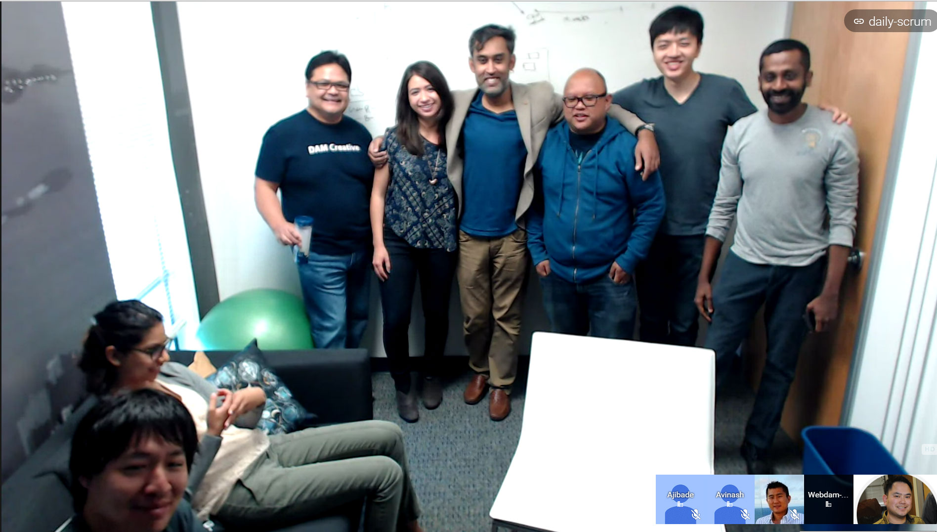
Me with the WebDAM team in 2015
The number of features that WebDAM started to provide was exploding. Instead of working with a new release every month or so, we were providing several new features every week. We started accommodating feedback from customers more, and with the large, skilled engineering team we were able to provide features much more quickly than ever.
In terms of what I was doing, I started focusing on single modules, such as the image and video cropping tool or the asset embed feature. In the meanwhile my development team was focusing on the iOS app and upgrading the features of our apps.

WebDAM is now Webdam
WebDAM was renamed to Webdam. The name originally meant Web Digital Asset Management, but then it became a single word Webdam, and this brought about a completely new branding. Due to my interest in branding, I took great interest in what the new brand was about. It was an effort by Shutterstock to make ‘Webdam’ a house hold name. The logo was changed from ‘connecting the dots’ to an ‘infinity’ logo and the colors changed from shades of orange to green. The look and feel was different from what I was used to for several years.
Branding changes to big products can be very daunting, and until the end of my contract with Webdam in April 2017, we really worked on rebranding the iOS app and the Webdam app itself.
It has been a fun journey, and Webdam continues to progress under the leadership of Shutterstock. They have many more customers than ever before, and the speed with which they are getting new customers is also much greater.
It feels great to be a part of a team that made a product like Webdam possible. We took Webdam from a simple Digital Asset Management app to a company that would eventually be aquired by a tech giant like Shutterstock. I have learnt a lot from this journey while working with a fast paced Silicon Valley team.
Now, onwards to more ideas and more products!
From Webdam to Shutterstock: The framework that enabled Digital Asset Management for the Web (Part 1)
I started working with Webdam in 2012 when Steve Rabkin first asked me to help him work on his product, which was called WebDAM at that time. His vision was to provide a simple but useful Digital Asset Management app for the web. He already had built an app but it didn’t have the functionality and the user experience that he was aiming for, and it was for that reason that he reached out to me.
We agreed to work together. I started working part time for him and his team, which included Jody Vendergriff and Leigh Ann.
For several months we focused on the user interface, and held several meetings about what the ideal WebDAM should look like and behave. Below are some early screenshots of the visual design that we were thinking of building.
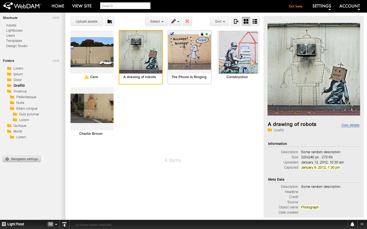
An early concept of the visual design of WebDAM.
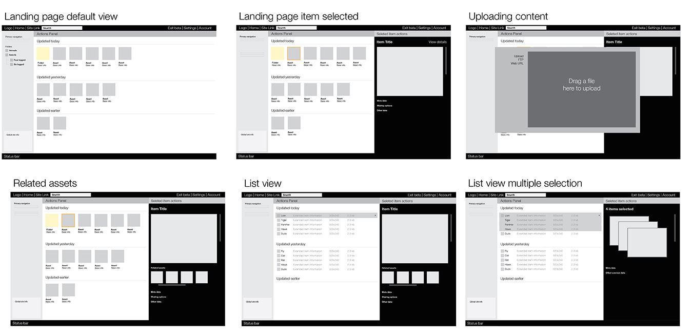
Some concepts of the early prototypes of WebDAM.
Eventually a design was approved and I went into a month or two of complete hibernation and isolation from the rest of the world and built the new user experience of WebDAM. I thought about how I would go about building the user interface, and I decided to write a simple JS framework to support the code base, with the aim of making it simple to build on. It was largely based on jQuery and at that time used new features of HTML5. I also left my day job during this time (I was working with Taya IT in Cairo, Egypt) so I could work on this project full time.
The first version of the user interface draft was completed towards the end of 2012. It wasn’t perfect, but it worked well and the prototype allowed everyone in the team to look at the proof of concept together.
Over the next few weeks we iterated on the design, and during this time Shan Weerasinghe helped work on a cleaner, and slicker skin for the WebDAM application – a visual implementation that is still alive to this day.
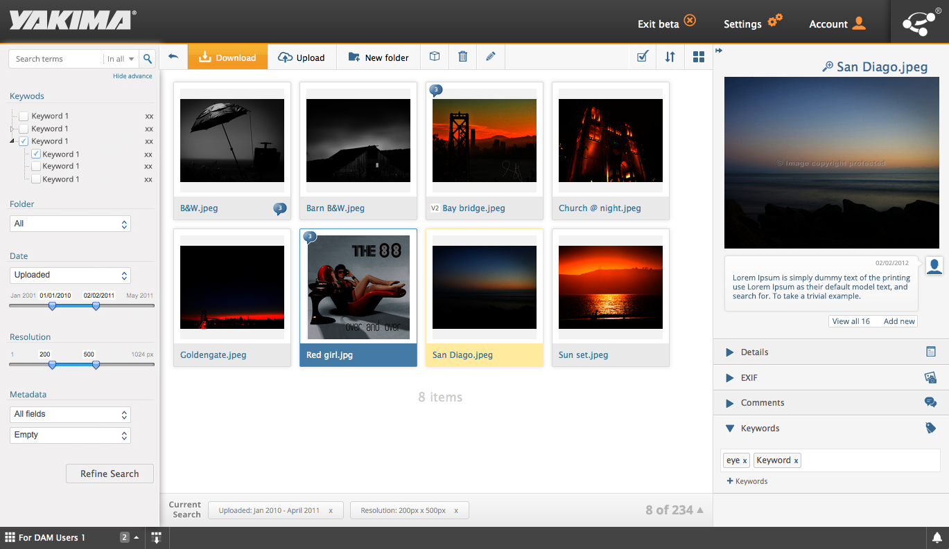
The WebDAM Core design changed over time. Here it is several months later.
I was able to establish myself as a permanent member of the team, and from that point onwards I worked regularly with Steve and his team. We slowly brought all the existing functionality of the previous WebDAM into the new user interface. Once existing functionality was completed, new functionality started taking shape. We thought about new ideas and how to implement them.
However, we needed to upgrade the web services of WebDAM. These had been hastily developed, and most web services were managed using a single file of code. We realized that we had to refactor this code quickly, and so I started building a new web services framework (later I gave this framework a name, Sapphire, and it still is the basis of products built by my company Takhleeq, such as Flynance and [an unnamed project]). This framework is still being used in the web services that power WebDAM.
With great customer support, combined with marketing and advertizing, WebDAM got several corporate customers. Eventually it caught the attention of Shutterstock and in 2014 it acquired WebDAM.
React Native tutorials!
I have started uploading some React Native tutorials that I hope others find useful. Here’s the latest one.
Please follow my channel to stay up-to-date with my videos!
Welcome to my updates section
I will use this section to talk about my work and experience. I recently updated my website and decided to add an updates section to talk about what’s happening. Check back later for more updates!