I have often worked with people and companies who have used Bootstrap in their products. For several years people have used Bootstrap to make responsive, user friendly and fairly consistent looking web apps.
Before I begin to talk about why I don’t think Bootstrap is a good idea for your products, I would like to go into its history. HISTORY LESSON! (summarized from LiveEdu.tv)
Boostrap was originall built for Twitter. The purpose was to make the interfaces of various products within Twitter look and feel consistent. It was first released to the open developer community in 2011, and since hten it has been improved with lots of new features and visual components.
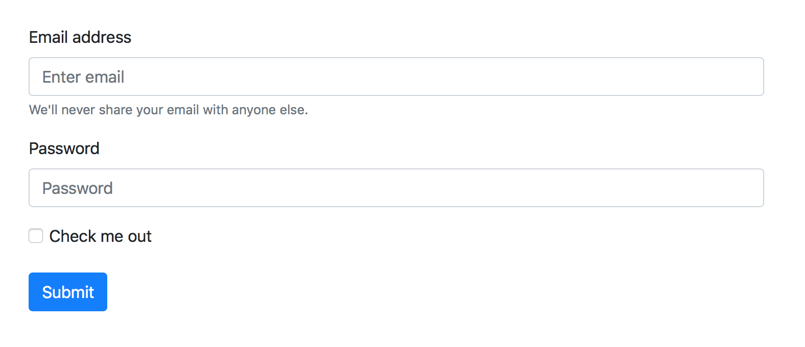
Until now, people want to build their products using Boostrap. They import a few JS and CSS files, and learn the vast vast knowledgebase of the Twitter library, and start adding Boostrap classes to their visual components. You could have something looking like this:

To this, in no time at all:
I’m sure you can see the appeal of using this library. The code of something like this is fairly easy to set up – you only need a basic knowledge of forms, HTML components and basic CSS to get this up and running.
Once you are knowledgable about Boostrap’s library of controls, you will be able to make an app fairly quickly…
… that looks the sameas every other app using Boostrap
… that follows the early branding guidelines of Twitter
… and is very hard to extend within your own app
The first two points may not be that important to you, but the third point is important from a branding and design point of view. Once brand guidelines have been defined, it is very hard to sway from them. The various elements within your app will have to conform to these guidelines to the pixel. Product owners, marketers, and pretty much anyone who is not involved in the development of an app is very very particular about how the app looks, and how well it conforms to the visual guidelines defined by your company.
Sure, if you are getting started, and you don’t have any guidelines to adhere to, you don’t have a problem. But things start going downhill very fast.
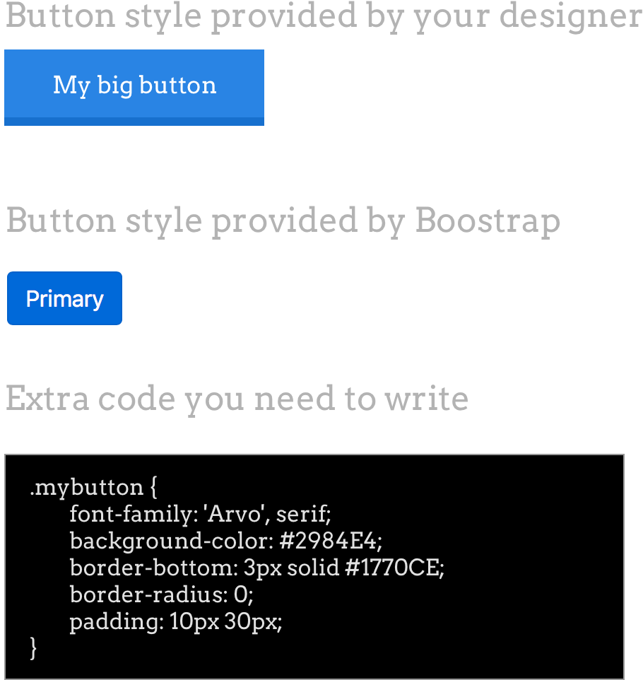
Imagine that you are required to make a simple button in your form, and your guidelines say otherwise, as shown by the following diagram:

You will end up having a big stylesheet that is basically overriding all the various components of boostrap. Inspecting your web element will show a whole lot of crossed out elements, and then finally your preferred element will be displayed at the very top.
Disclaimer: There is nothing I hate in this world more than !important
And here we have arrived at the purpose of my blog post: If you are a full stack developer like me, and you have to closely follow your visual guidelines (whether you made them yourself, or someone else made them) you have to write a lot of code to make sure that your visual elements are in sync with your guidelines.
Things become worse when your app must be responsive, and you have to override your overrides to make sure that your components work well.
So, there is no reason to include Boostrap in your product. If you are making a prototype app, then sure no problem. But as with every prototype you should make, it should be throw-away code (discard it after you use it). There is no reason to learn all the components in Boostrap’s library – make your own, and make sure your company follows them, just as Twitter once did. What should be learnt from Boostrap is not their vast library of components that has been engineered so that every app in the world can use it, what you should learn instead is that your company and your product has well-defined guidelines, and that every member of your team are well aware of them, and follow them.
You will over time improve your own guidelines and include new components that your product needs, and you will become more efficient in making visuals using your own hand-written code.
Update: One question I perhaps didn’t answer is ‘why now?’. To answer this, I will simply say that now is the time to give it up. In this day and age, we are required to program quickly and make the first version of the app in very little time, and therefore frameworks like Boostrap have a strong appeal. But if you are thinking long term, then you should have a set of visual components that you should use, and that you have full control over how they appear. You will then also have the ability to easy port your own visual components to other frameworks like React Native or Angular, and you will be able to build brand-accurate mobile apps too!